Global Attribution Mapping (GAM) and neural networks
An open source approach for explaining neural networks

By Mark Ibrahim, Melissa Louie, and Ceena Modarres, Capital One
Neural networks are all around us: from mustaches on Instagram to facial recognition for unlocking your iPhone. Yet, in situations where the stakes are high, one hurdle to broad adoption of this technology is the difficulty associated with explaining predictions—we can’t untangle the inner complex reasoning producing predictions. This has sparked an area of research striving for transparency called Explainable AI.
While scientists have developed techniques to explain both single and multiple predictions relative to their inputs, these techniques only provide limited transparency.
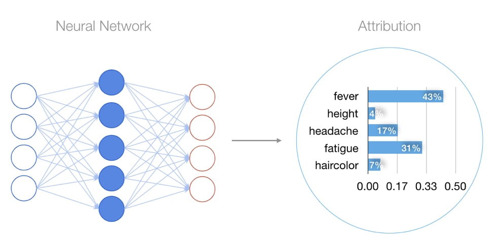
Local attributions explain a single prediction by assigning an importance score to each input. A model predicting whether a patient has the flu might have local attributions assigning high importance to symptoms such as fever and fatigue, but low importance to traits such as height and hair color. The key constraint of local attribution techniques is that they are limited to explaining a single prediction.
When training neural network models, understanding many predictions is often very important, since models typically make predictions across a large population. Global explanations of predictions are important both for developers to understand overall model behavior, but also for assessing potential model bias.
Many existing global techniques are limited because they assign the same explanation to all observations. In contrast, neural network models are effective because they learn complex interactions between inputs and outputs across observations. Existing global techniques often train a simpler model that may lack fidelity to the true patterns learned by neural network models.
To address these limitations, we developed a technique called GAM (Global Attribution Mapping) capable of explaining neural network predictions across subpopulations. This approach surfaces subpopulations with their most representative explanations, allowing us to inspect global model behavior.
Local attribution techniques background
We base our global attribution mapping on local attribution techniques that approximate the non-linear patterns learned by a neural network. LIME (local interpretable model-agnostic explanations) approximates feature importance by perturbing the inputs around a neighborhood, then fitting a more interpretable model. DeepLIFT and Integrated Gradients take advantage of the neural network’s architecture using the gradient to pick out the feature dimension contributing most to the prediction. Some of our earlier research examined benchmarks of the reliability and sensitivity of these techniques to hyperparameters in the context of risk prediction.
We found that unfortunately, these techniques alone leave practitioners with thousands or potentially millions of individual explanations that are difficult to inspect. Imagine trying to read thousands of flu symptom logs to determine the importance of a particular symptom, and how that would differ across subpopulations. Our approach, GAM, distills these attributions into just a handful of explanations to reveal subpopulations with similar prediction reasons.
How GAM works
Treating attributions as weighted rankings
The first step for GAM is to define a common vocabulary describing the information in attributions. In this work, we treat attributions as rankings of the inputs, telling us which are most important. Each attribution also carries a weight for each input, quantifying its relative importance for a prediction. This formulation allows us to represent attributions as conjoined (sharing the same elements) weighted rankings.
What’s the relevance here? By representing attributions in this convenient mathematical structure, we can compare the similarity of local attributions using existing weighted rank distance metrics.
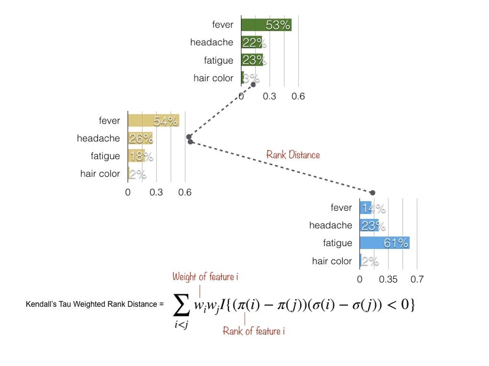
One such metric is Kendall’s Tau Weighted Rank Distance, which penalizes the distance between attributions relative to the weight of each feature that appears out of order. Let’s stick with the flu example. If fever appears with high importance for one patient, but low importance for another, the distance between the two explanations grows. This metric allows us to quantify how similarly two attributions rank the importance of inputs.
Grouping similar attributions
Now that we can quantify similarity, we’d like a way to group similar attributions to distill the many explanations into just a few. Using our vocabulary of attributions as rankings, we adapt the k-medoids clustering algorithm to use rank distance. To accurately describe distance we first normalize attributions into absolute percentages of feature importances.

scatter plot image: https://en.wikipedia.org/wiki/Cluster_analysis#/media/File:SLINK-Gaussian-data.svg
After selecting the number of subpopulations we wish to surface, we apply the modified k-medoids algorithm to group similar explanations. We then get a single explanation for each subpopulation that is most representative (by minimizing rank distance). We can tune the number of subpopulations we surface to extract more or less granular global explanations
Global explanations
The global explanations as described above provide multiple layers of information. First, we get a single explanation that’s most representative for each subpopulation: “which symptoms are most important for a subpopulation?” This allows us to succinctly approximate the non-linear representations learned by the neural network in terms of global feature importances. Second, we get the size of each subpopulation: “for how many people are these symptoms important?” This allows us to understand the percentage of the population each explanation best describes. Finally, we get the individual points associated with each explanation, allowing us to trace explanations to each observation’s inputs.
These three layers are valuable for model diagnostics: understanding corner cases and exploring opportunities for feature engineering. They also augment model developers’ level of comfort with the algorithm learning meaningful inputs for predictions.
For the flu example, global explanations might surface that for a proportion of individuals headache and fatigue are useful symptoms for diagnosing the flu, whereas fever and sneezing may be for others. Doctors can explore the characteristics of each group using these explanations to understand how humans respond differently to the flu.
Global Attribution Mapping (GAM) library
In addition to the theoretical contribution, we developed an open source tool for generating global explanations, also called GAM (“Global Attribution Mapping”). GAM makes it easy to generate global explanations based on local attributions.
In code, this looks like:
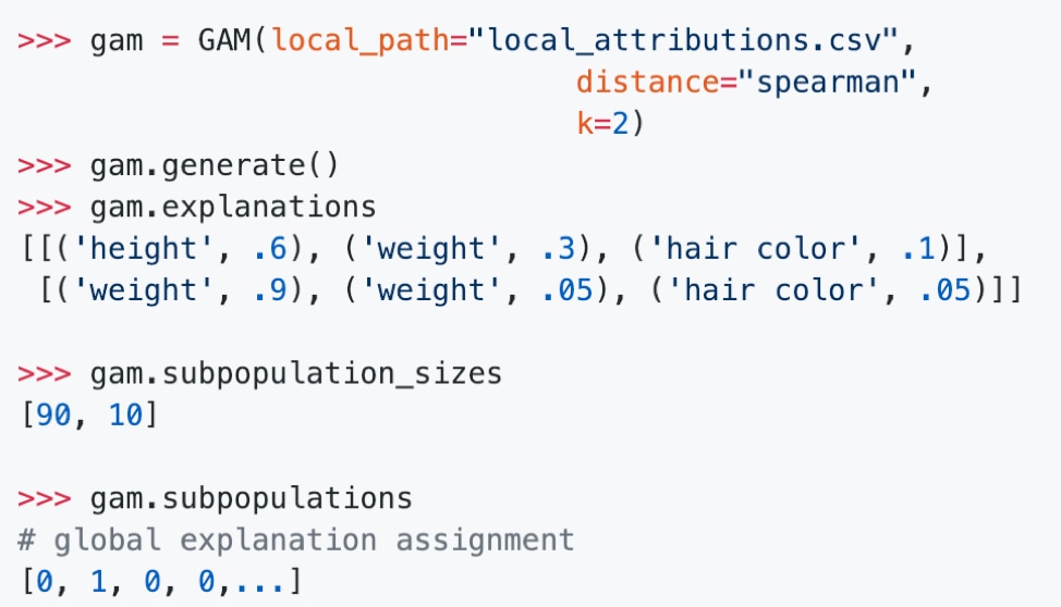
The GAM class above surfaces subpopulations with similar explanations along with their most representative attribution. We’re working on ways to improve the library’s computational efficiency and add richer tools for exploring global model behavior. Feel free to contribute features or suggestions via GitHub!
Global explanations
We hope global explanations will help continue to shed light on the black-box of deep learning. With increased transparency, we can help ensure predictions are generated for the right reasons.
If you’d like to dig more into the technical details, our paper is available here.