A Comparison of Data Visualization Libraries for React
Similarities & differences between Recharts, Nivo, Victory, react-vis, & Viser

TL;DR
There are so many open source data visualization libraries built upon D3.js (also known as D3, short for Data-Driven Documents); however, no one resource really has a comprehensive comparison of all the data visualization libraries available specifically for React.
Therefore, I did this research to see which React data viz libraries would best serve my team’s needs before starting a project using charts to visualize data. If you know the problems around using D3 and React together, jump to General Comparison of Data Viz Libraries.
The Gold Standard - D3
Before jumping into our five libraries I wanted to quickly go over D3, the gold standard for data viz libraries. D3 allows you to bind arbitrary data to a Document Object Model (DOM), and then apply data-driven transformations to the document to create interactive SVG charts with smooth transitions and interaction.
So, wait! D3 sounds great and you call it the gold standard, then why not use D3 outright? Well, if you were creating a very specific chart type not provided by one of the libraries in this article it might make sense to use D3. Otherwise, using one of these libraries will make your life much easier because there are issues to using D3 in React!
Problems with using D3 in React
First, if you don’t know how to use D3 it is going to take quite some time to learn and implement. It has hundreds of functions and its own unique way of handling things for you. It may take you days to learn how to create a chart using D3 in React versus using an existing library which could create the same chart in minutes.
Second, D3 also introduces some difficulties when used in React. These problems originate from the fact that React and D3 both manipulate the DOM. If you are using React as your framework, it’s likely you choose it because of this magic thing called Virtual DOM that makes React applications efficient and fast. This is where the problem with D3 comes in. A rule of thumb when writing applications in React is that you shouldn’t be messing with the real DOM directly. When you use D3 in React, and if you utilize its DOM manipulating function, you will be changing the real DOM which means you are relinquishing all React has to offer in terms of performance and efficiency.
“Both React and D3 are two excellent tools designed with goals that sometimes collide. Both take control of user interface elements, and they do so in different ways.” - Marcos Iglesias, Bringing Together React, D3, And Their Ecosystem.
Although it is not impossible to use D3 in React, and there are great discussions (1, 2, 3) about how to do it the right way, if you are creating a project that will use common chart types it’s perhaps the right choice to use a library other than plain D3.
Here is the code snippet of a stacked area chart I created to give you an idea of how plain D3 works in React. All the math calculations are done by D3 sub-modules and React is used to update the DOM.
Please compare it to the other libraries’ code I put below. And keep in mind that in contrast to the charts created with the libraries below, this chart doesn’t have a tooltip and is not responsive. While you can add those, and even give the chart zooming or brushing capabilities, it is time consuming and requires a good understanding of SVG/canvas elements and D3.
General Comparison Of Data Viz Libraries
To be honest, I don’t remember running into any other subject in the JavaScript world that has so many libraries dedicated to it. This is why I was inspired to do this research. Here is how I started:
My Approach for Elimination and Picking the Right Library
Research
I searched many websites that listed React data visualization libraries, talked to my peers who were creating data visualizations, wrote down a long list of options, and picked five of them to dive into. These five were Recharts, Victory, Nivo, react-vis, and Viser.
Table.1 - Comparison of five libraries selected for this research.
(This table was created in June 2020. For an updated comparison see here.)
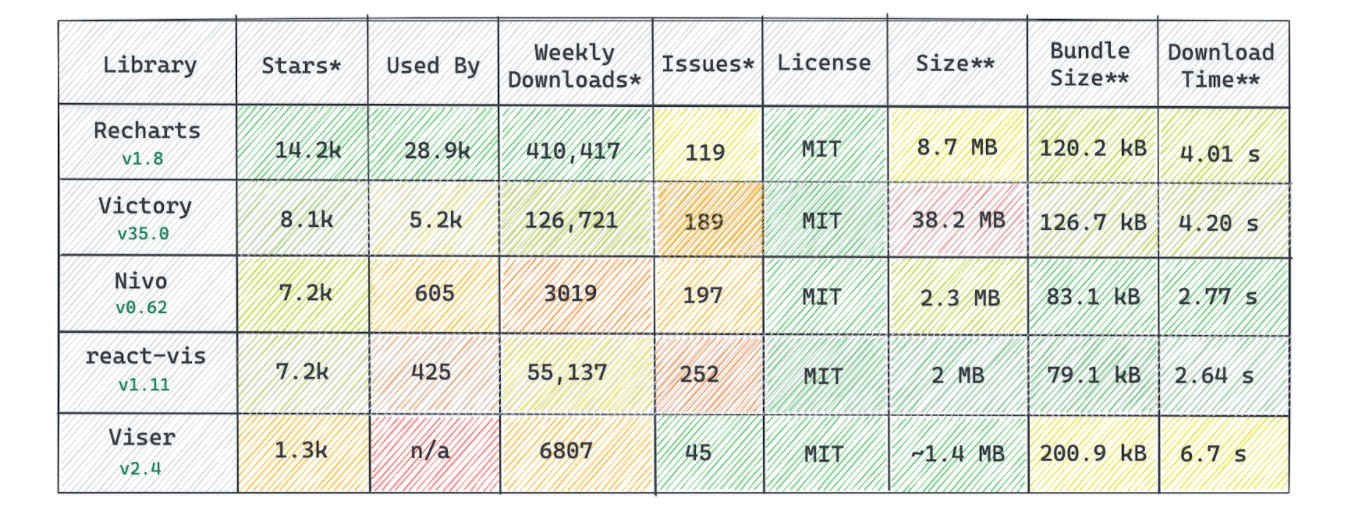
Created by author. Note: Colors are relative to each library information listed here. * Recorded in June 2020 ** Total size occupied in node_modules directory after installing as a dependency *** BundlePhobia results for minified+gzipped size and download time for 2G edge.
Comparison
I compared them by some of the features that I cared the most about. Those features being:

Then, I rated them based on my desired features and use case:

- Created by author.
A Quick Project
I scaffolded a create-react-app and created a stacked area timeseries chart with each library to see how hard it was to work with them. You can see the sandbox for that project here.
Recharts
SVG render | Responsive Charts | Types available | No zoom/brush
Highlights
The first things I noticed about Recharts was its simplicity, smooth animations, and popularity. I was also really impressed with its modern looking default styles with a smooth tooltip. Additionally, TypeScript (TS) is the main language used which means it comes with type definitions; very convenient if your application is also written in TS.
Recharts is built on React components that produce SVG elements for rendering shapes with lightweight dependency on D3 submodules. So, in plain English: Recharts does some math calculations with D3 functions and uses React to draw them in view.
Documentation
Recharts has a great, simple guide section which will take you through the best way to utilize what it has to offer. It also has an examples page where you can find different example charts along with an interactive coding box and jsfiddle links, as well as detailed documentation about its components. You can see the data shape you should be using to generate each chart both in API documentation and examples pages.
Coding Style
Find the Github Gist here.

- Created by author.
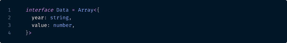
Data shape:
- Created by author.
Result:
- recharts.org
You add the components you need in the wrapper component and customize them by their props. It provides a ResponsiveContainer component for creating responsive graphs.
See the comparison app here for a real-life example and Performance Results for profiler performance of this library in a real-life situation.
Victory
SVG render | Responsive Charts | Types available | Zoom/brush available
Highlights
Since I started searching for a data-viz library, everyone I asked mentioned Victory once, if not twice. Indeed, there is a reason it is so popular. Victory is an open source software project out of Formidable Labs, Inc. Check out their other OSS projects here.
Perhaps the biggest bonus one gets from Victory is that it is also available in React-Native, which is useful if your application is also available as a mobile app. It is the only library I have found so far which is available for both web and mobile applications.
Like most of the other libraries, Victory also utilizes D3 submodules and React to update the view, generating SVG elements to display the charts.
Documentation
Even though it has comprehensive documentation, Victory’s docs were a little hard to learn from compared to the others in this article. Occasionally, I found myself scratching my head and pondering how to create a chart customized in the way I wanted. Sometimes, it was hard to collect all the info I needed to customize a chart from different parts of the Victory docs.
Coding Style
Victory’s coding style, however, is pretty easy to understand and conform to. It is declarative enough to understand what is happening, even if one doesn’t know anything about this library. The logic to it is to select a container component that meets your needs and fill it with all the necessary child components to customize your chart. Every component also exposes certain props to even further customize the details.
Find the Github Gist here.

- Created by author.
Data shape:

- Created by author.
Result:

- formidable.com/open-source/victory/
A great feature is that it exposes the below components, which makes creating brushing or zooming interactions as easy as just wrapping your chart with one of these components:
- VictoryZoomContainer: Adds pan and zoom functionality to a chart.
- VictoryVoronoiContainer: Associates mouse position with the nearest data points, and is useful for tooltips and other hover interactions.
- VictorySelectionContainer: Adds the ability to select points within a region.
- VictoryBrushContainer: Adds a moveable highlighted region to charts.
- VictoryCursorContainer: Renders a cursor line and label that follows mouse position.
See the comparison app here for a real-life example and Performance Results for profiler performance of this library in a real-life situation.
Nivo
SVG, Canvas, Server render | Responsive Charts | Types partially available | No zoom/brush
Highlights
As its website url implies, Nivo rocks! It is a robust, easy-to-use, very well documented, stylish, and performant library. However, it has some downsides like not having type definitions for all parts and zooming/brushing capabilities. Nevertheless, those features are under active development, which means we should have them soon (see here for zoom, here for brush, here for types). If you don’t need zooming or brushing right away, or if you can wait for some of the type definitions, Nivo is worth looking into.
Nivo, again, uses D3 for the math and has React to update the views. In contrast to others, it gives you three different rendering options. You can either choose to render your graphs in SVGs or canvas -if you have loads of data- or you can use isomorphic rendering. Server-side rendering is Nivo’s unique feature, it even provides a HTTP rendering API for most of the charts.
Documentation
Nivo has exhaustive documentation where you can tweak all the props for the selected chart components and build what you want right in the docs. You can also clearly observe what data shape you should be using for the particular chart. The only thing left to you as a developer is to copy/paste the code you need and pass your own data to it in your application after creating the chart in the component playground. Can’t find what you need exactly amongst the documentation examples? Well, they also have Storybook examples for many different situations where you can get the needed code.
Coding Style
Nivo’s coding style is unique compared to the others. Instead of having a container component wrapping many different child elements, in Nivo charts you actually have only one component with many props to tweak its look.
Find the Github gist here.
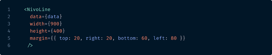
- Created by author.
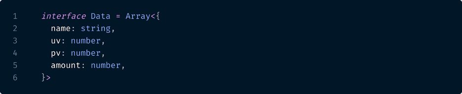
Data shape:

- Created by author.
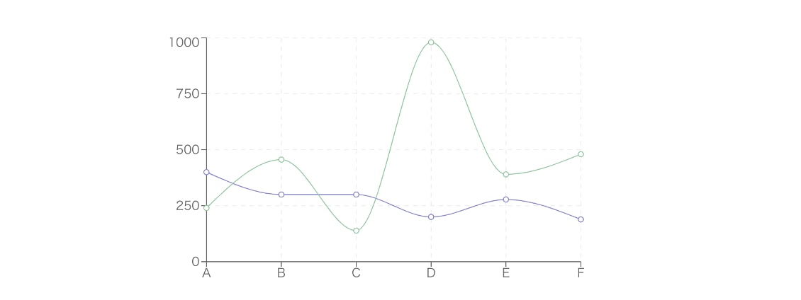
Result:
- www.nivo.rocks
Plus, Nivo charts render notably faster for the initial render compared to the others (see Performance Comparison part).
A quick note to developers who are going to use Nivo, don’t forget to define a height value for the wrapper element around your chart if you are using a responsive chart.
See the comparison app here for a real-life example and Performance Results for profiler performance of this library in a real-life situation.
React-vis
SVG, Canvas render | Responsive Charts | Types available | Zoom/brush available
Highlights
React-vis is a simple and powerful library that was originally built to support Uber’s internal tools. Landing on the react-vis website, it welcomes you with a pretty impressive set of interactive graphs.
Documentation
React-vis has relatively good documentation that will take you through the basic steps of how to use react-vis very quickly, letting you create a simple chart in just a couple of minutes. I think it is really easy to scaffold a simple chart with react-vis. However, once you dive into the details and start customizing it, it gets a little harder to find what you need. Thankfully, they also share a Storybook so you can find code snippets for different chart examples.
React-vis is again a combination of D3 submodules and React behind the scenes.
Coding Style
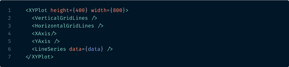
Their way of coding the components is also kind of unique. Even though you, again, have a container and bunch of children elements in it, the container is always going to be XYPlot. You select the chart component, which they call series, and throw it in the XYPlot. Then, you add the axes and other small parts as children.
Find the Github Gist here.
- Created by author.
Data shape:
- Created by author.
Result:
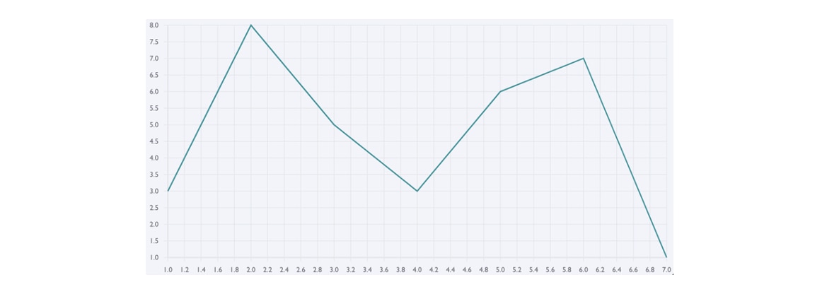
- uber.github.io/react-vis/
See the comparison app here for a real-life example and Performance Results for profiler performance of this library in a real-life situation.
Viser
Canvas render | Types available | Zoom/brush available
Highlights
Viser is a promising visualization library for the three most popular frameworks - React, Vue, and Angular. It has a smaller user base than the others on the list, I think it is a really valuable library that has many useful features.
Documentation
Although some parts of Viser’s documentation are written in Chinese, which is less than helpful for an English speaking audience, it has a great demo page where you can find answers to the majority of your questions. The demo page has an interactive coding box where you can observe the code along with the data that shapes the graph. You can also change and run the code again to see the changes. Then, all you do is copy and paste!
In contrast to the other libraries examined in this article, Viser is built on G2 -a highly interactive data-driven visualization grammar for statistical charts- instead of D3. One thing to keep in mind about Viser is that it renders canvas elements (not SVG elements out-of-the-box as the others).
Coding Style
Find Github Gist here.

- Created by author.
Data shape:
- Created by author.
Result:

- viserjs.github.io/
See the comparison app here for a real-life example and Performance Results for profiler performance of this library in a real-life situation.
Performance Profiler Results of Data Viz Libraries
Here is an overview of the profiler results of the charts.

- Created by author.
Because there is a lot of information to compare in React Profiler I won’t go into detail about the render durations. From this flame graph of of the first render, the ranking of the charts from fastest to slowest is:
- Nivo (2.5ms)
- Viser (3.4ms)
- React-vis (16.4ms)
- Recharts (64.7 ms)
- Victory (138.5ms)
If you’d like to go into detail here and observe the profiler on your own, here are the steps to generate this flame graph:
- Go to the detached version of the comparison project here.
- Open up the devtools and navigate to Profiler tab. (If the Profiler tab is not available, install React dev tools from Chrome extension store.)
- Click on the “Reload and start profiling” button. This will trigger a refresh.

- Created by author.
- After the app completely refreshes, click on the red “Stop profiling” button.

- Created by author.
Conclusion
Since it was released in 2011, D3 has helped developers easily visualize data with its hundreds of math functions and DOM manipulating functions. Shortly after, in 2013, React was released and made updating DOM fast and easy, unlocking many new possibilities. Developers working in React quickly realized that it was not so easy to tame D3 and make it get along with React. Thus, the React data visualization library ecosystem came alive, making it possible to create data visualizations easily and faster through reusable React components.
Finally, here we are in 2020, going through a comparison of five great React data visualization libraries. They all have great documentation, with lots of reusable examples of charts, a great React-y way of coding so that you feel at home, and a huge supporting community to make sure you are never let down. Consequently, these libraries make coding data visualizations fun and easy, as well as efficient, maintainable, reusable, consistent, and easy-to-read.
*Header image: freepik.com